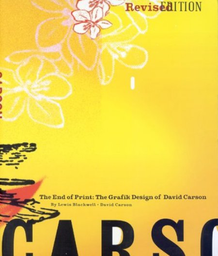
The End of Print
Lewis Blackwell and David Carson
Quick Facts
Published 10/1/2000
Paperback
11.3 x 9.4 x 0.7 inches
172 pages
Around 200 layouts
Chuck's Comments
David Carson is a graphic designer who is best known for turning typographical layouts upside down. Text that's backwards, 20 sizes too large, run together, overlapping photographs, illegible, etc. are all signs of his work. It's a mad genius type of thing, that makes the text slightly harder to read, and draws toy into trying to decipher it.
There aren't many posters here, but his work for the Ray Gun magazine featured a lot of music performers so that's why it's here.
Site is © 2007-2010 Charles R. Grosvenor Jr.
